You have an event, we have the right ticketing and agenda. In order to sell as many tickets as possible for your event, besides embedding the event on your website, having a pricing strategy, implementing targeted communication measures or designing your own tickets, it's also worth having a convincing event description with a good photo.
Here are a few tips on how you can make your event entry catchier so that it stands out more in the search results and in our event calendar. That way, you can look forward to your sold-out event days in advance and devote yourself entirely to your anticipation.
Event title
Since Google Search doesn't display titles that are too long anyway, a short and concise title for your event is the best solution. The title should be meaningful and informative. You can express yourself here with upper and lower case letters and special characters such as @+-!()/ etc. It is often worth including the main figures of the event and/or the event location.
Event picture
We live in a world where picture are almost more important than text. That's why an appealing event picture is your event's calling card, when someone browses through our event agenda. It is important that the image is of good quality and atmospheric. A landscape format image with a size of 1568x958 pixels (minimum size: 748x479 pixels) is ideal.
If you know a bit about image editing, it is also an advantage to add your event title, date and location, or other important points in the image. However, make sure that the image is not too overloaded, as it will ultimately only be displayed small in the agenda. And as mentioned, if there is too much text, there is a risk that ticket buyers won't read any of it.
Event description
Long event descriptions like school essays are a thing of the past. Today, unique and catchy descriptions are needed, for example using keywords and lists. Humorous event descriptions also trigger positive feelings in interested parties, which means that you as the organizer will be remembered. Here are a few points that you should consider in your next description:
-
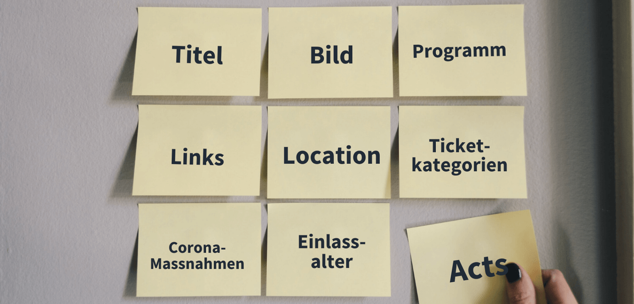
sensible structuring and division of information, whereby the most important information should generally always be at the top (e.g. time schedule, program, timetable, supporting program, catering, transport, admission conditions, dress code)
-
Address ticket buyers and visitors directly and avoid passive sentences
-
Avoid spelling mistakes by checking them in word processing programs (e.g. Microsoft Word)
-
Different styles: lists, sections, formatting for italic or bold text or even emojis
-
Link websites and social media profiles of your DJs or other people and organizations involved
Always remember: there are no limits to your creativity in the event description. Fortunately, there's a preview function at the top right of the cockpit so you can always check how convincing your new event description looks to your ticket buyers.
Short description
The short description is a mandatory field and is limited to 200 characters. With Eventfrog AI you can have this description created automatically from the longer event description. This makes your short description search engine optimized and your event is easier to find on Google and other search engines - which can lead to more ticket purchases.
What else?
-
For even more reach for your event - for example through online ads or advertising in print media - we offer a wide range of promotion options.
-
Whether it's advertising space with messages for your audience, logo placements for your sponsors or the presentation of your own vouchers – make sure you take advantage of the large and versatile space on your tickets!
-
The green on our tickets is not your favorite color? Then create your tickets in your own design.
-
Link your event or embed the pre-sale directly on your own website or set up your own pre-sale points.
All this and much more is possible and worthwhile for your event. Our advice: just give it a try!
More tips for your event ticketing


