Filter:
Events in
welche
in
stattfinden.
Dating
Dating / Single-Party
Dating / Sonstige Veranstaltungen
Dating / Speed-Dating
Diverses
Essen & Trinken
Fasnacht / Fasching / Karneval
Fasnacht / Fasching / Karneval / Party
Fasnacht / Fasching / Karneval / sonstige Veranstaltungen
Fasnacht / Fasching / Karneval / Umzug
Festivals
Festivals / Electronic
Festivals / Film
Festivals / Hip-Hop & Rap
Festivals / Jazz & Blues
Festivals / Kunst & Kultur
Festivals / Pop & Rock
Festivals / Schlager & Volksmusik
Festivals / Tanz
Festivals / Theater
Festivals / Weitere Festivals
Freizeit & Ausflüge
Freizeit & Ausflüge / Ausfahrt
Freizeit & Ausflüge / Ausflug
Freizeit & Ausflüge / Brauchtum
Freizeit & Ausflüge / Eventreisen
Freizeit & Ausflüge / Film & Kino
Freizeit & Ausflüge / Gaming
Freizeit & Ausflüge / Gruppen & Spiele
Freizeit & Ausflüge / Info-Event
Freizeit & Ausflüge / Sonstige Veranstaltungen
Freizeit & Ausflüge / Stammtisch
Freizeit & Ausflüge / Tag der offenen Tür
Freizeit & Ausflüge / Wanderung
Führungen & Vorträge
Führungen & Vorträge / Business-Treff
Führungen & Vorträge / Firmenvortrag
Führungen & Vorträge / Führung
Führungen & Vorträge / Live-Fotoreportage / Diashow
Führungen & Vorträge / Podium
Führungen & Vorträge / Stadtführung
Führungen & Vorträge / Symposium
Führungen & Vorträge / Tagungen & Kolloquien
Führungen & Vorträge / Vortrag
Gesundheit & Spiritualität
Gesundheit & Spiritualität / Gesundheit & Wohlbefinden
Gesundheit & Spiritualität / Selbsthilfegruppe
Gesundheit & Spiritualität / Spiritualität
Gesundheit & Spiritualität / Wellness
Kinderveranstaltungen
Kinderveranstaltungen / Babys
Kinderveranstaltungen / Familienveranstaltungen
Kinderveranstaltungen / Ferienprogramm
Kinderveranstaltungen / Jugendliche
Kinderveranstaltungen / Kinderfest
Kinderveranstaltungen / Kinderführung
Kinderveranstaltungen / Kinderparty
Kinderveranstaltungen / Kindertheater
Kinderveranstaltungen / Kinderzirkus
Kinderveranstaltungen / Konzert
Kinderveranstaltungen / Kurs
Kinderveranstaltungen / Puppentheater
Klassik & Opern
Klassik & Opern / Ballett & Tanz
Klassik & Opern / Klassik
Klassik & Opern / Oper & Operette
Konzert
Konzert / A cappella & Vocal
Konzert / Blasmusik
Konzert / Chor
Konzert / Country
Konzert / Electro
Konzert / Folk
Konzert / Funk & Soul
Konzert / Gospel
Konzert / Gothic & Wave
Konzert / Hard Rock & Heavy Metal
Konzert / Hip-Hop & Rap
Konzert / Indie & Alternative
Konzert / Jazz & Blues
Konzert / Kirchenmusik
Konzert / Latin
Konzert / Offene Bühne
Konzert / Pop & Rock
Konzert / Punk
Konzert / Reggae & Ska
Konzert / Rhythm & Blues
Konzert / Schlager & Volksmusik
Konzert / Singer & Songwriter
Konzert / Swing
Konzert / Techno
Konzert / Weitere Musikrichtungen
Konzert / World & Ethno
Kunst & Ausstellungen
Kunst & Ausstellungen / Ausstellung
Kunst & Ausstellungen / Finissage
Kunst & Ausstellungen / Kultur
Kunst & Ausstellungen / Vernissage
Kunst & Ausstellungen / Weitere Kunstveranstaltungen
Kurse & Seminare
Kurse & Seminare / Allgemeinbildung
Kurse & Seminare / Berufliche Bildung
Kurse & Seminare / Coaching
Kurse & Seminare / Computer & EDV
Kurse & Seminare / Familienweiterbildung
Kurse & Seminare / Freizeit & Hobby
Kurse & Seminare / Glauben & Religion
Kurse & Seminare / Kunst & Kultur
Kurse & Seminare / Musik & Tanz
Kurse & Seminare / Sonstige Kurse & Seminare
Kurse & Seminare / Soziale Weiterbildung
Kurse & Seminare / Sport & Fitness
Kurse & Seminare / Sprachen
Kurse & Seminare / Wirtschaft
Messen
Messen / Gewerbeschau
Messen / Kongress & Tagung
Messen / Landwirtschaftsschau
Messen / Messe
Musicals & Shows
Musicals & Shows / Modeshow
Musicals & Shows / Musical
Musicals & Shows / Show
Musicals & Shows / Tanzshow
Musicals & Shows / Travestie
Musicals & Shows / Varieté
Musicals & Shows / Zirkus
Märkte
Märkte / Flohmarkt
Märkte / Kinderflohmarkt
Märkte / Kunstmarkt
Märkte / Mittelaltermarkt
Märkte / Sammlermarkt
Märkte / Second Hand
Märkte / Sonstige Märkte
Märkte / Weihnachtsmarkt
Märkte / Wochenmarkt
Party
Party / 00's
Party / 70's
Party / 80's
Party / 90's
Party / Afterwork
Party / Ball / Gala
Party / Charts & Open Format
Party / Country & Folk
Party / Dancehall
Party / Disco
Party / Dubstep & D'n'B
Party / Electro
Party / Goa
Party / Gothic & Wave
Party / Halloween
Party / Hip-Hop & Rap
Party / House & Techno
Party / Karaoke
Party / Latin & Brasil
Party / LGBTIQ
Party / Mottoparty
Party / Pop & Rock
Party / Schlager & Volksmusik
Party / Silvesterparty
Party / Sonstige Partys
Party / Studentenparty
Party / Swing
Party / Trance & Ambient
Politik & Gemeinde
Politik & Gemeinde / Gemeinde
Politik & Gemeinde / Politik
Religion & Feiertage
Religion & Feiertage / Fest- & Feiertag
Religion & Feiertage / Gottesdienst
Religion & Feiertage / Sonstige Veranstaltungen
Sport & Fitness
Sport & Fitness / Ballsport
Sport & Fitness / Eishockey
Sport & Fitness / Fitness
Sport & Fitness / Freizeitsport
Sport & Fitness / Fußball
Sport & Fitness / Handball
Sport & Fitness / Hundesport
Sport & Fitness / Kampfsport
Sport & Fitness / Leichtathletik
Sport & Fitness / Marathon
Sport & Fitness / Motorsport
Sport & Fitness / Nordic Walking
Sport & Fitness / Pferdesport
Sport & Fitness / Public Viewing
Sport & Fitness / Radsport
Sport & Fitness / Sonstige Veranstaltungen
Sport & Fitness / Tanzsport
Sport & Fitness / Tennis
Sport & Fitness / Tischtennis
Sport & Fitness / Trainingszeiten
Sport & Fitness / Turnen
Sport & Fitness / Unihockey
Sport & Fitness / Volleyball
Sport & Fitness / Wandern
Sport & Fitness / Wassersport
Sport & Fitness / Wintersport
Sport & Fitness / Yoga
Theater & Bühne
Theater & Bühne / Bühnenveranstaltung
Theater & Bühne / Comedy & Kabarett
Theater & Bühne / Experimentelles Theater
Theater & Bühne / Lesungen
Theater & Bühne / Pantomime
Theater & Bühne / Poetry Slam
Theater & Bühne / Tanz
Theater & Bühne / Theater
Volksfeste
Volksfeste / Chilbi / Kirmes / Jahrmarkt
Volksfeste / Sommerfest
Volksfeste / Sonstige Feste
Volksfeste / Stadtfest
Volksfeste / Umzug & Parade
Volksfeste / Weinfest
Wissenschaft und Technik
Führungen & Vorträge in der Schweiz
Top-Orte
Aarau
Altdorf UR
Altstätten SG
Appenzell
Baar
Baden
Basel
Bern
Burgdorf
Bülach
Cham
Chur
Dietikon
Genève
Gossau SG
Grenchen
Horw
Kloten
Kriens
Köniz
Langenthal
Lausanne
Lenzburg
Liestal
Luzern
Montreux
Muttenz
Münchenstein
Olten
Pratteln
Rapperswil SG
Rheinfelden
Riehen
Rorschach
Schaffhausen
Schwyz
Solothurn
St. Gallen
Stans
Steffisburg
Sursee
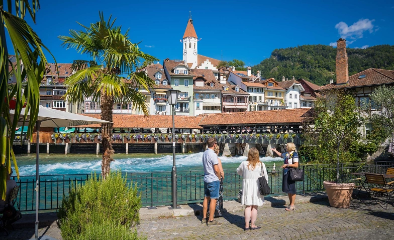
Thun
Visp
Wettingen
Wil SG
Winterthur
Zofingen
Zug
Zürich

Eventgruppe
bis Aug
17
DER WEISSE TURM - Einführung ins digitale Bauen der Zukunft
33 Events
Weisser Turm, Mulegns (CH)

Jul
16
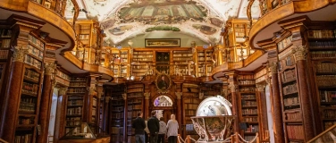
Altstadtführung St.Gallen mit Kathedrale & Stiftsbibliothek
Mittwoch, 16. Juli, 11:00
St.Gallen-Bodensee Tourismus, St. Gallen (CH)
Eventgruppe
bis Dez
31
Sammlungsarchive - Führung
46 Events
Museum für Gestaltung (Toni-Areal), Zürich (CH)

Eventgruppe
Jul - Jul
16 - 30
Highlights im Schloss
6 Events
Schloss Wildegg, Wildegg (CH)

Eventgruppe
Jul - Okt
16 - 15
Zeitreise zu den Anfängen der Eidgenossenschaft
2 Events
Forum Schweizer Geschichte Schwyz, Schwyz (CH)
Jul
16
«Handstick-Stobede» im Museum Appenzell
Mittwoch, 16. Juli, 14:00
Museum Appenzell, Appenzell (CH)
Eventgruppe
bis Nov
29
Öffentliche Stadtführung Thun DE / ENG
27 Events
Welcome-Center im Bahnhof Thun, Thun (CH)

Jul
16
Altstadtführung Solothurn
Mittwoch, 16. Juli, 14:30
St. Ursentreppe, Hauptgasse 66, 4500 Solothurn, Solothurn (CH)
Tickets
Eventgruppe
bis Nov
1
Öffentliche Führung
8 Events
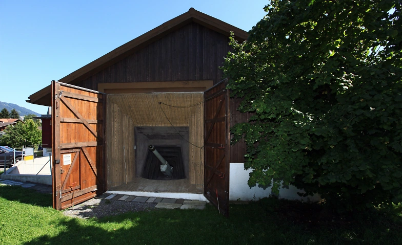
Artilleriewerk Faulensee, Spiez (CH)

Eventgruppe
bis Sep
13
Ausstellungsrundgang «Vija Celmins»
60 Events
Fondation Beyeler, Riehen (CH)

Eventgruppe
bis Okt
15
Öffentliche Schlossführung
4 Events
Schloss Schadau, Thun (CH)

Jul
17
Kodak Demo S.......
Donnerstag, 17. Juli, 10:00
SUPAG Spichtig und Partner AG, Dällikon (CH)
Abgesagt
Jul
17
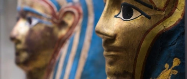
Seminar: Ägypten in Basel
Donnerstag, 17. Juli, 10:00
Museum der Kulturen Basel, Basel (CH)

Eventgruppe
bis Aug
7
süsse versuchung - Vortrag
3 Events
Post Hotel Löwe, Mulegns (CH)

Jul
17
Kodak Demo S.......
Donnerstag, 17. Juli, 13:00
SUPAG Spichtig und Partner AG, Dällikon (CH)
Eventgruppe
bis Dez
18
Besichtigung der Senevita Altersresidenz Bornblick
6 Events
Senevita Residenz Bornblick, Olten (CH)

Jul
17
LANDLUST
Donnerstag, 17. Juli, 15:00
Klosterhalbinsel Wettingen, Wettingen (CH)
Jul
17
Dorfrundgang Lengnau
Donnerstag, 17. Juli, 16:00
Lengnau BE, vor dem Gemeindehaus, Lengnau (CH)

Jul
17
Kodak Demo S.......
Donnerstag, 17. Juli, 17:00
SUPAG Spichtig und Partner AG, Dällikon (CH)
Jul
17
(Un)gleichgewicht? – Paare in der Gestaltung
Donnerstag, 17. Juli, 18:00
Museum für Gestaltung (Toni-Areal), Zürich (CH)
Jul
17
Vortrag «Krieg in der Filmkunst»
Donnerstag, 17. Juli, 19:00
Museum Altes Zeughaus, Solothurn (CH)
Eventgruppe
bis Nov
13
Führung Sammlung Jean Tinguely
7 Events
Museum Tinguely, Basel (CH)
Tickets
Eventgruppe
bis Aug
30
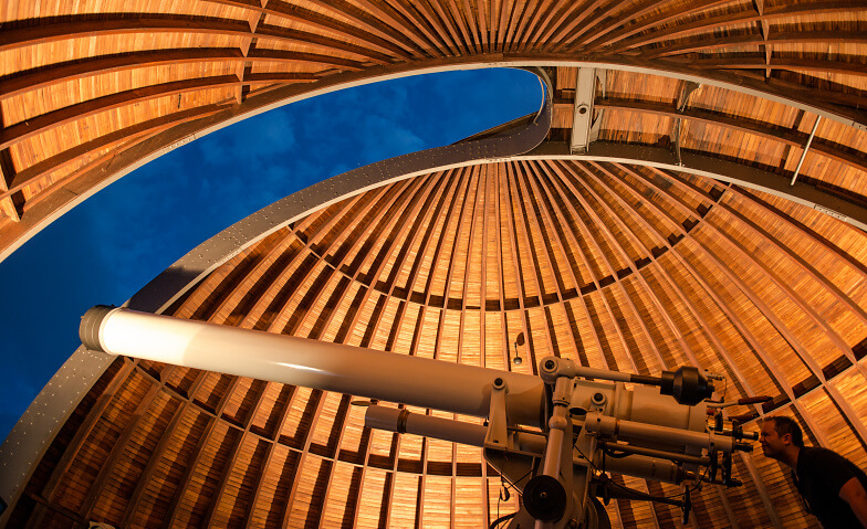
Öffentliche Führung zum aktuellen Abendhimmel
19 Events
Urania-Sternwarte Zürich, Zürich (CH)

Eventgruppe
bis Aug
15
Volksmusik
4 Events
Forum Schweizer Geschichte Schwyz, Schwyz (CH)

Eventgruppe
bis Jul
19
Guided tour of St.Gallen’s old town
2 Events
St.Gallen-Bodensee Tourismus, St. Gallen (CH)
Jul
18
Altstadtführung St.Gallen mit Kathedrale & Stiftsbibliothek
Freitag, 18. Juli, 11:00
St.Gallen-Bodensee Tourismus, St. Gallen (CH)
Eventgruppe
bis Jul
23
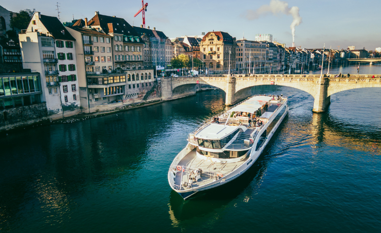
Führung uff em Rhystärn
2 Events
Rhystärn der Basler Personenschifffahrt AG, Basel (CH)

Jul
18
Die Stickerin zeigt ihr Kunsthandwerk
Freitag, 18. Juli, 14:00
Museum Appenzell, Appenzell (CH)

Eventgruppe
bis Aug
14
Roman Signer. Landschaft
8 Events
Kunsthaus Zürich, Zürich (CH)
Jul
18
Erzählcafé zum Geburtstag von Hans Küchler
Freitag, 18. Juli, 16:00
Kunstmuseum Olten, Olten (CH)

Tickets
Eventgruppe
bis Aug
29
Old town public tours (Visp, Valais)
5 Events
Visp Gewerbe und Tourismus (VGT), Visp (CH)
Jul
18
Spezialführung - auf den Spuren der "Uhrmacherin"
Freitag, 18. Juli, 17:30
Bahnhof Süd Grenchen, Grenchen (CH)
Tickets
Jul
18
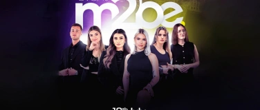
Meant2BE Event Zürich
Freitag, 18. Juli, 18:00
Glockenhof Zürich, Saal London, Zürich (CH)
Online-Verkauf beendet
Jul
18
Öffentliche Führung durch die Essbare Landschaft - Abgesagt
Freitag, 18. Juli, 18:00
CULINARIUM ALPINUM, Stans, Stans (CH)

Jul
19
Öffentliche Stadtführung
Samstag, 19. Juli, 09:50
beim Zytturm, Zug (CH)
Eventgruppe
bis Nov
2
Diskussionslabor: Philosophieren im Parlatorium
32 Events
Klosterhalbinsel Wettingen, Wettingen (CH)

Eventgruppe
Jul - Aug
19 - 30
Bilderlust und Lukullisches
2 Events
Museum Franz Gertsch, Burgdorf (CH)

Tickets
Eventgruppe
bis Sep
6
Führung Turm Schloss Holligen
12 Events
Turm Schloss Holligen, Bern (CH)

Jul
19
Altstadtführung St.Gallen mit Kathedrale & Stiftsbibliothek
Samstag, 19. Juli, 11:00
St.Gallen-Bodensee Tourismus, St. Gallen (CH)

Eventgruppe
bis Aug
23
Öffentliche Altstadtführung Burgdorf
6 Events
Schloss Burgdorf, Burgdorf (CH)
Wenige Tickets
Jul
19
Stadtführung - Altstadtrundgang
Samstag, 19. Juli, 13:00
Aarau Info, Aarau (CH)
Jul
19
Altstadtführung Solothurn
Samstag, 19. Juli, 14:30
St. Ursentreppe, Hauptgasse 66, 4500 Solothurn, Solothurn (CH)

Eventgruppe
Jul - Okt
19 - 5
Ausstellungsrundgang «Rose Wylie. Flick and Float»
24 Events
Zentrum Paul Klee, Bern (CH)

Eventgruppe
bis Jul
29
Theatertour: Nichts als die Wahrheit
3 Events
Museum Luzern, Luzern (CH)

Eventgruppe
bis Sep
20
Stadtführung - Luzerns Stadtbefestigung, die Museggmauer
2 Events
Tourist Information, Luzern (CH)

Tickets
Jul
19
Nachtwächter Ralf Rundgang SCHWEIZERDEUTSCH gesprochen 19Jul
Samstag, 19. Juli, 21:30
Rosengart Platz, Luzern (CH)

Eventgruppe
bis Okt
19
Vogelbeobachtung für Einsteiger: Tipps und Tricks
5 Events
Besuchszentrum Schweizerische Vogelwarte, Sempach (CH)

Eventgruppe
bis Aug
17
Ausstellungsrundgang Marisa Merz. In den Raum hören
3 Events
Kunstmuseum Bern, Bern (CH)